Back a few months ago software company Rivolu offered us a chance to download and test their TideTrac app. Shamefully it went on the to-do list but was buried by a cascade of seemingly urgent tasks and never done.
A renewed interest in tides over the past week or so just happened to coincide with another email from Rivolu suggesting we take a look at their latest upgrade to TideTrac (version 2.0). We downloaded the app last week and have been putting it through its paces. The screenshots that follow were pulled off my iPad on Monday morning.
TideTrac was originally written for the iPad, and while it really shines on the iPad’s larger screen real estate, version 2.0 has brought support for the iPhone as well (more below).
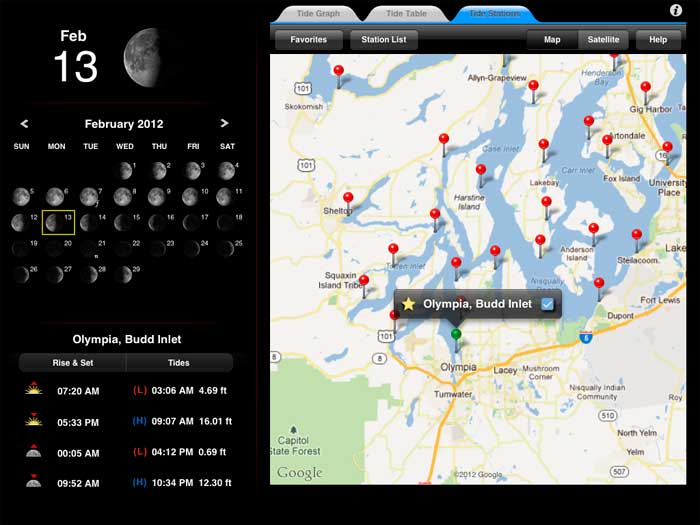
Speaking not as a tech designer but a tech user, TideTrac’s interface is clean, crisp and intuitive. From the station view (image above) the several thousand available tide stations in the US are marked clearly and easily selectable in the almost omnipresent Google maps format.
A simple check box (the star) allows you to mark a tide station as a favorite, doing so prompts the program to automatically download a year’s worth of tide data so that you can access it without internet connectivity. Nifty.
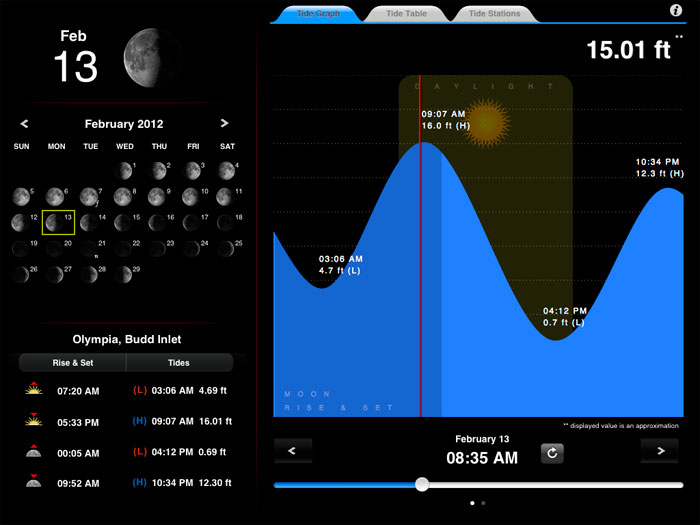
The Tide Graph view is particularly ingenious from where we sit. The standard view includes a pocketful of key tide, solar and lunar data – sun rise and set, moon rise and set as well as times for the high and low tides for the day. A full month lunar phase calendar is provided and is the interface to select different days of the month for detailed tide data display.
A very nifty new feature is the scroll bar situated below the tide graph for the chosen day; the scroll bar allows you to manually select a time of day to see the most current tide level prediction down to your chosen minute.
A quick swipe to the right brings into view four days’ tide graphs at once.
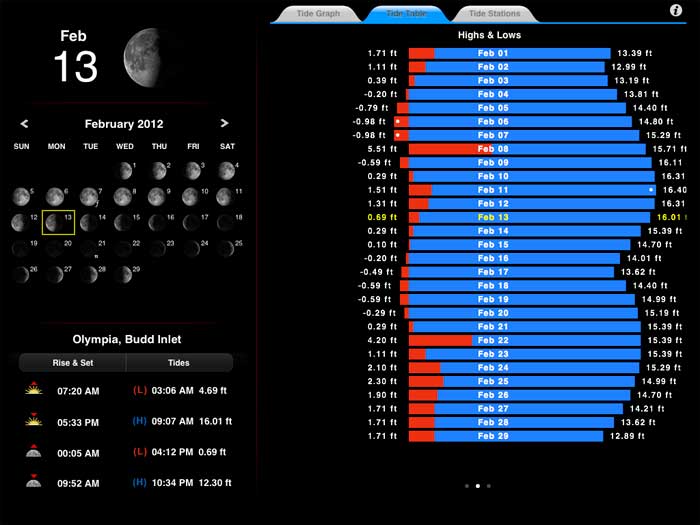
The Tide Table view offers a very interesting graphical summary of the month’s tides in a bar graph format that allows you to see at a glance when the highest and lowest tides will occur. A swipe (right) brings into view a full month calendar with the times of the high and low tides posted each day.
On the iPhone just about everything described above displays with surprising readability, even for my bifocaled eyes; the principle difference being that the graphic lunar calendar view isn’t included.
Now for a common sense caveat. The tide data displayed in the app are based upon astronomical tide predictions and do not take into account the local effects of current meteorological events – wind, rain, storms, runoff and flooding, etc. This is NOT a navigation tool and the exact tide behavior where you’re standing on a given day may not match the tide data predictions precisely. As a fly fisherman or photographer, you’re interested in overall tide behaviors, not pedantic microdata, right?
Bottom line, if any aspect of your fly fishing involves attention to tidal flows (and you’ve embraced the Apple ecosystem), this is probably the best $1.99 you’ll spend this year. Take a look at supported tide stations here.
Rivolu offers several other intriguing apps. LightTrac is that one other that really caught our attention – it displays key solar and lunar data for photographers. Worth a look and we’ll see if we can scrounge up a copy for a review down the road.


